OBIEX MOBILE APP DESIGN
Building version 3.0 of the Obiex app
Category
Mobile App
Service
Obiex HQ
Website
Overview
Obiex is a cryptocurrency fintech platform designed to help users buy, sell, trade, and use crypto seamlessly.
As part of the v3.0 redesign, the goal was to reduce the barrier to entry for new users while still supporting experienced traders with more advanced functionality
The Problem
Cryptocurrency adoption is growing—but for many users, especially beginners, the experience is still:
Overwhelming and technical
Difficult to navigate
Lacking trust and clarity
From research, I identified a key tension:
Crypto apps are either too complex for beginners or too limited for experienced users.
This created:
High onboarding friction
User hesitation due to security concerns
Drop-offs before first transaction
My Role
Led end-to-end product design
Conducted user research & interviews
Designed core flows and UI
Built prototypes for testing
Collaborated with PMs, engineers, and marketing
User Research & Key Insights
I interviewed:
1.Crypto beginners 2.Active traders 3.Long-term holder
Key Insights:
Fear & Intimidation
Beginners were overwhelmed by jargon and complex flows.
Fragmented Experiences
Beginners were overwhelmed by jargon and complex flows.
Trust & Security Concerns
Beginners were overwhelmed by jargon and complex flows.
Speed Matters for Advanced Users
Experienced traders prioritized fast, efficient execution.
Key Desicions and Trade Offs
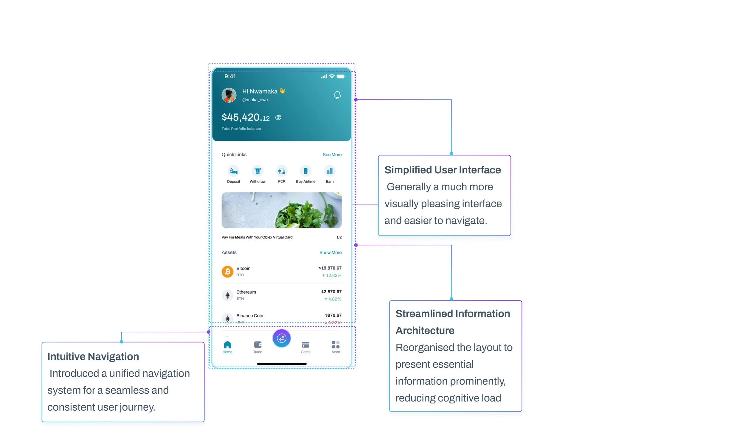
Simplified Navigation vs Feature Depth
Reduced interface complexity for first-time users
Prioritized clarity over feature visibility
Advanced features were progressively disclosed
Tradeoff: Power users needed extra taps—but beginners could onboard faster.
Guided Onboarding vs Speed
Introduced product tours + education flows
Helped users understand crypto basics before action
Tradeoff: Slightly longer onboarding, but improved confidence and trust.
All-in-One Platform vs Simplicity
Integrated:
Trading
Utility payments
Earn & loans
Tradeoff: More features increased complexity, so UI had to stay minimal.
Solution
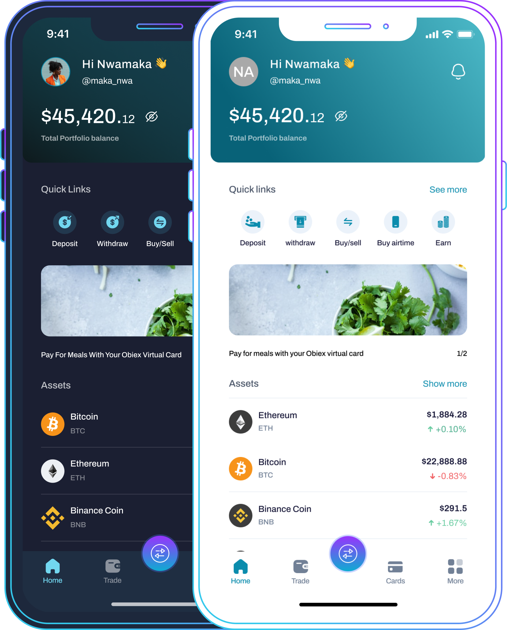
Intuitive, Beginner-Friendly Interface
Clean layout with clear actions
Reduced cognitive load for new users
Security-First Experience
Reinforced trust through:
Clear feedback states
Transparent flows
Secure interaction patterns
Guided Onboarding Experience
Step-by-step product tours
Education built into the product
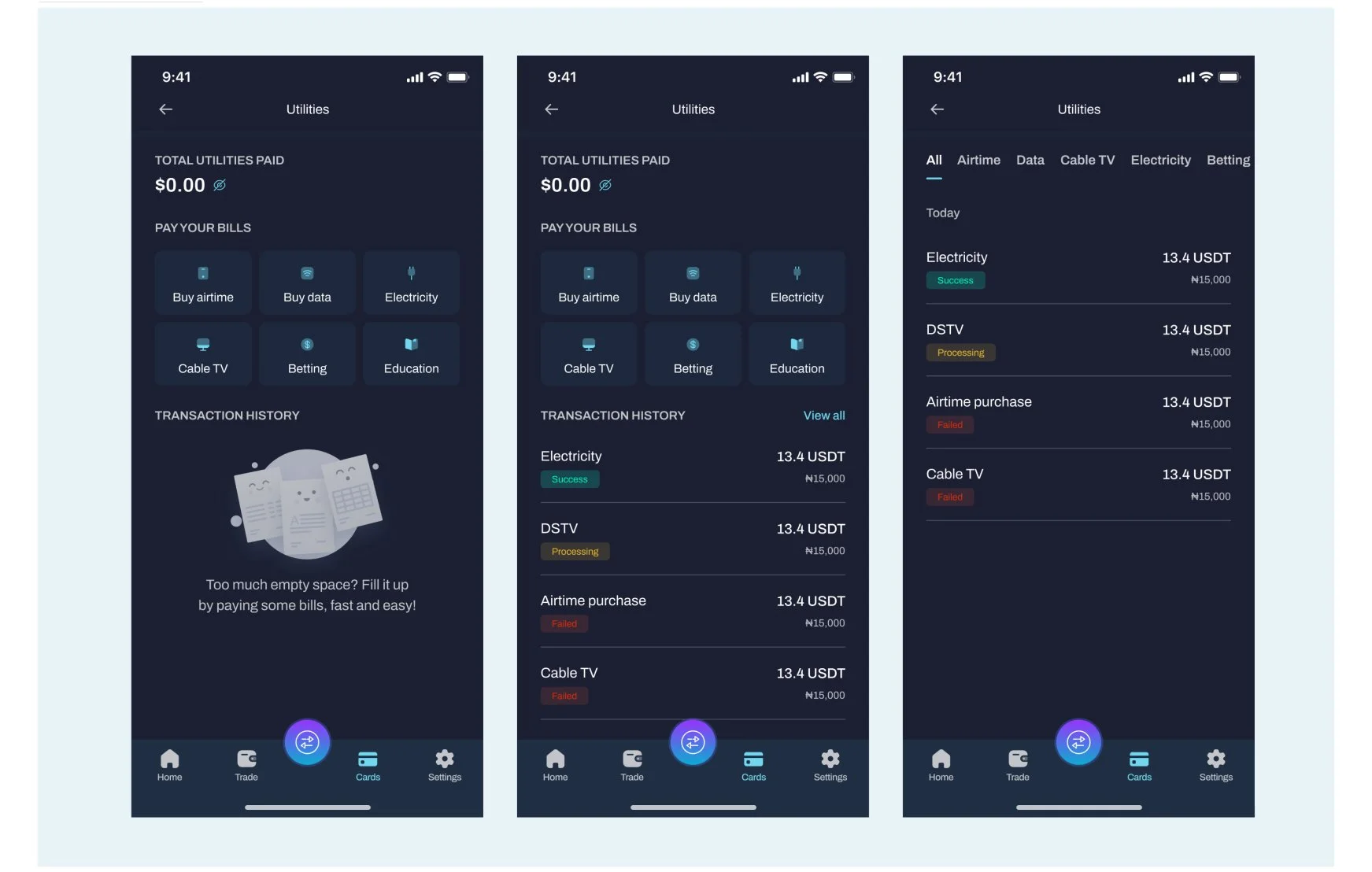
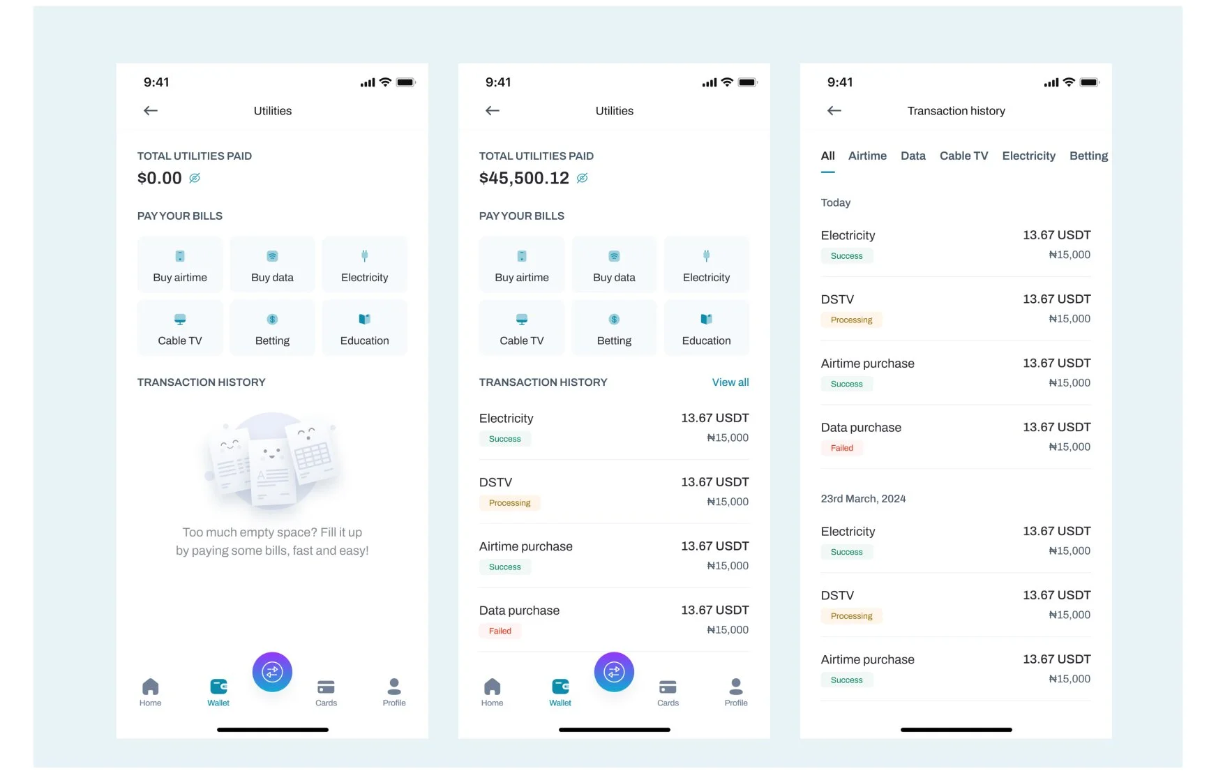
Expanded Crypto Utility
Users can now:
Pay bills using crypto
Earn interest on holdings
Access crypto-backed loans
Design Highlights
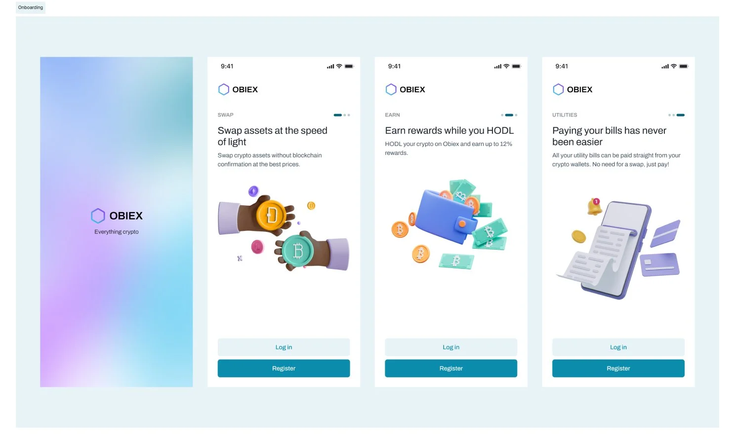
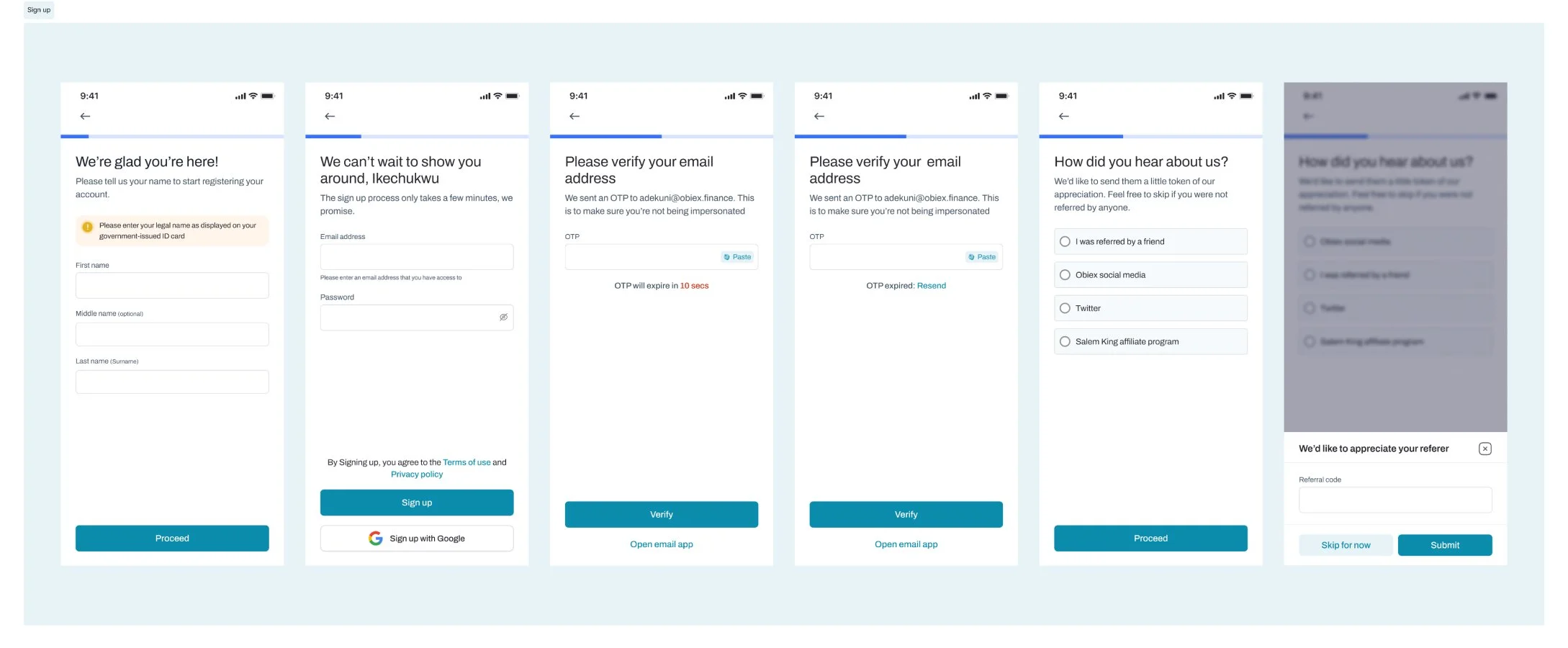
Streamlined Onboarding Flow
I created a smoother and more engaging experience for new users as they get started with the app.
Utility Payment Experience
Impact
The redesign was aligned with business goals to:
Reduce onboarding friction
Increase first-time transactions
Improve user confidence in crypto usage
Expand product adoption beyond trading
The platform continues to support seamless crypto transactions, swaps, and payments across multiple assets
Conclusion
By focusing on user research, iterative design, and feedback integration, the crypto app successfully underwent a transformation that not only addressed existing pain points but also positioned the platform as a leader in providing an exceptional user experience in the competitive crypto trading landscape.
Reducing friction is not just about UI, it’s about confidence. The best products don’t just solve one problem, they expand user value.
This case study highlights the importance of understanding user needs and continuously evolving to meet the dynamic expectations of the crypto community.